Ontolog Forum
OOR Logo Candidates
A solicitation was announced for candidate logos for OOR. The is a workspace where submitted candidates are placed side-by-side for review, discussion and selection purposes.
- [new!] (ppy/2011.09.12-21:36) ... Winning design for the OOR Logo is: (ref.)
 ... Hashemi-final
- The Final Round of Polling is now online ... Cast your votes now!
- see the two final candidate designs here
- open this polling form in a separate window/tab (so you can see both the form and the candidate designs at the same time) ... (right-mouse-click the "polling form" link and select "open in new tab or window")
- This poll closes at 9:00pm PDT on Mon 2011.09.12
- (for the record) ... The design submission and selection process is described here and slightly updated
- comments are solicited (on/before 2011.06.09) from everyone, to help the designers prepare their final submission (which needs to be in by 2011.06.13) - one design plus a brief description of the design concepts
- we will do a final poll between 2011.06.14~2011.06.23 to select our final OOR Logo of choice (schedule has been delayed ... see updates below!)
- First round polling results:
- "Hashemi-4," "Hashemi-c" and "Milov-1" were selected as finalists ("Hashemi-4" and "Hashemi-c" may be finally submitted as one design or two, as the designer may decide)
- 13 participants entered 35 votes all together, and candidates "Hashemi-4" and "Hashemi-c" scored highest, each with 6 votes
- behind that, were "Milov-1 with 4, and "Ding-1" and "Hashemi-a" with 3 votes each
- We ran a first round of polling (to shortlist 2 candidates) - the poll closed at 9:00pm PDT on Thu 2011.05.19 ... The top two (2) logo designs will be shortlisted for further refinement, and will then go into a final polling round to determine which design will get adopted as the OOR Logo.
- [Poll is now closed!] open this polling form in a separate window/tab (so you can see both the form and the candidate designs at the same time) ... (right-mouse-click the "polling form" link and select "open in new tab or window")
- we are collecting the final submissions (from finalists Ali Hashemi and YuriyMilov). We might do the final selection in a two-step process - pick the graphic design first, and then deliberate on the choice of color(s). ... --ppy/2011.06.30 (I personally introduced the delay, because I got sick after an early June trip and was out of commission for a bit. Apologies.)
Collected candidates are at (this page): http://ontolog.cim3.net/file/work/OOR/OOR-Logo/OOR-Logo-candidates/
Final Design Candidates
To be voted on in our final poll: ... let's pick one of the two designs first, we'll defer to the winning designer to define the default color(s) later ... vote here
From Ali Hashemi ...
 ... Hashemi-final ... (ref.)
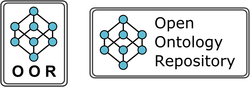
- AliHashemi: The rationale behind the icon is that it is a Hasse diagram for a Boolean lattice. It is an easily recognizable figure and reflects to some degree the structure of how ontologies are stored in OOR and hints at the lattice of theories. Imo, it speaks to users of the OOR ... (ref.)
.
From Yuriy Milov ...
 ... Milov-final ... (ref.)
- YuriyMilov: I have returned to a simple text ("Open Ontology Repository") combined with the asymmetrical symbol (related to the OOR abbreviation and some more hidden ideas). Such symbol could be also used separately (for example, for special buttons, so on) as soon as it is recognized as the OOR symbol. ... This design shows the OOR ambition to become a standard approach as well as a symbol ("a head on X") for the future semantic age. ... (ref.)
.
Final Submissions
Note that we are still in process of collecting the final submissions ...
From Ali Hashemi ...
 ... Hashemi-GreenFinal ... (ref.)
 ... Hashemi-BlueFinal ... (ref.)
 ... Hashemi-GreyFinal ... (ref.)
 ... Hashemi-OORLine ... (ref.)
- AliHashemi: The rationale behind the icon is that it is a Hasse diagram for a Boolean lattice. It is an easily recognizable figure and reflects to some degree the structure of how ontologies are stored in OOR and hints at the lattice of theories. In my opinion, it speaks to users of the OOR. ... In terms of font, I went with something that was more techie, namely Agency FB. It might not be the most immediately recognizable choice, but it is unique and looks (to my eye) a bit futuristic. ... (ref.)
.
From Yuriy Milov ...
 ... Milov-final-1 ... (ref.)
- YuriyMilov: I have returned to a simple text ("Open Ontology Repository") combined with the asymmetrical symbol (related to the OOR abbreviation and some more hidden ideas). Such symbol could be also used separately (for example, for special buttons, so on) as soon as it is recognized as the OOR symbol. ... This design shows the OOR ambition to become a standard approach as well as a symbol ("a head on X") for the future semantic age. ... (ref.)
.
Finalists (work-in-progress)
The two designs shortlisted for final submission (after first poll closed on 2011.05.19)
 ... Hashemi-c ... (ref.) <--Finalist
and/or
 ... Hashemi-4 ... (ref.) <--Finalist
... plus,
 ... Milov-1 ... (ref.) <--Finalist
Various ideas from the designers (comments solicited) to help with the final design submission
 ... Hashemi-f1-red ... (ref.)
.
 ... Hashemi-f2-green ... (ref.)
.
 ... Hashemi-f3-blue ... (ref.)
.
 ... Hashemi-f4-white ... (ref.)
. . . . . .
 ... Milov-f1-red ... (ref.)
.
 ... Milov-f2-green ... (ref.)
.
 ... Milov-f3-blue ... (ref.)
.
 ... Milov-f4-white ... (ref.)
.
Reference
 ... BioPortal-1 ... (ref.)
.
Candidates received from the community
.
 ... Baclawski-1 ... (ref. message thread)
- this is being withdrawn by Ken Baclawski, as the "circled R" are reserved and cannot be legally used in some countries
- Ken also notes that if we want something to just swap into the BioPortal Code, then we might want to stay with that size and dimensional proportion (ref. here)
- this should not be our constraint on logo selection (it is only convenient)
.
 ... Ding-1 ... (ref.)
.
Sowa-1 - The following procedure would create OO above the R to make the order clear:
- 1. Draw 3 tangent circles (with thin lines) with two circles above and one circle centered below the other two.
- 2. Enclose the above structure in a larger circle (possibly with some 3-D effects, such as a raised surface).
- 3. Choose a font with rounded letters and distort the R to cause its top to have the same curvature as the enclosed circles.
- 4. Overlay Os on the top two circles.
- 5. Overlay R on the bottom circle.
- 6. Erase the original guide circles.
.
 ... Ding-2 ... (ref.)
.
 ... Ding-3 ... (ref.)
.
 ... Milov-1 ... (ref.) <--Finalist
.
 ... Milov-2 ... (ref.)
.
 ... Milov-3 ... (ref.)
.
 ... Milov-4 ... (ref.)
.
 ... Milov-5 ... (ref.)
.
 ... Alvidrez-1 ... (ref.)
.
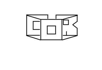 ... Hashemi-1 ... (ref.)
.
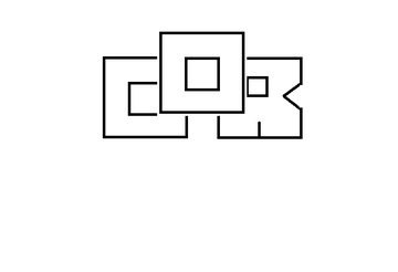 ... Hashemi-2 ... (ref.)
.
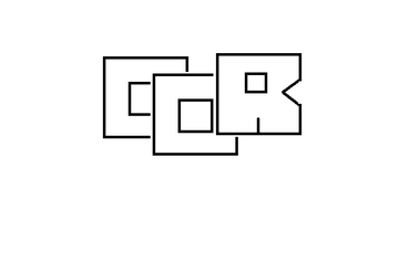 ... Hashemi-3 ... (ref.)
.
 ... Hashemi-4 ... (ref.) <--Finalist
- check out JohnSowa's comments here
.
 ... Hashemi-5 ... (ref.)
.
 ... Hashemi-6 ... (ref.)
.
 ... Hashemi-7 ... (ref.)
.
 ... Hashemi-8 ... (ref.)
.
 ... Hashemi-9 ... (ref.)
.
 ... Hashemi-a ... (ref.)
.
 ... Hashemi-b ... (ref.)
.
 ... Hashemi-c ... (ref.) <--Finalist
.
 ... Hashemi-Cassidy-d ... (ref.)
- Pat Cassidy: I like the visual "open" top [of the "Hashemi-6" oor-box2 design], but would also like some representation of an ontology lattice inside if it doesn't get too complicated. (This is bad art, if it looks good, someone else should do the art work better.)
.
 ... Obrst-1 ... (ref.)
.
 ... Obrst-Hashemi-2 ... (ref.)
.
- Again, we are now in the first round of polling (to shortlist 2 candidates) - this poll closes at 9:00pm PDT on Thu 2011.05.19 ... The top two (2) logo designs will be shortlisted for further refinement, and will then go into a final polling round to determine which design will get adopted as the OOR Logo.
- open this polling form in a separate window/tab (so you can see both the form and the candidate designs at the same time) ... (right-mouse-click the "polling form" link and select "open in new tab or window")
Thanks for helping us select our OOR Logo!

